Sunday, 19 November 2017

Halima Cassell: Ceramic Artist

I enjoy looking at and into the clay sculptures by Cassell. The deep carving of the clay that she has mastered offer depth and light/shade as well as symmetry. They feel very satisfying somehow, in their symmetry and lack of fussy colour, relying on light and shade to give shape and tone to the forms

Image result for halima cassell


Helix  unglazed stoneware

The mid grey colour is spattered with tiny inclusions that offer texture as well as colour contrast all be it very subtle. The colour is not the theme and it doesn't distract from the form. The shape is a sphere with deep ravines of whirling pattern remind me of the unfurling of a flower centre or a leaf. The shape is femine and in her personal statement refers to these qualities being important in her work. A place where she always seems to end up.


Image result for halima cassell

Acapella

This form is made of bronze. The form is like a vase again with a signature form of deep curving ravines. The forms seem very tactile. The colour of the bronze is warm and though the geometry is "sharp" in its measurement and exactitude, the edges are not sharp looking, like a cutting edge, but slightly rounded off so that with a slight alteration it looks feminie rather than aggressive.


Artist Statement

I was interested to find the artists own statement about her work and like her descriptions of her influences and the desire to capture geometry in a way that is new. Her respect for the golden ratio and the strengths of the materials, plus a desire to push the materials and form to their limits. I felt like this gave me some things to think about in terms of printing processes which is where my interest currently lies.

http://www.halimacassell.com/artist/58bff8dfe5b41/Artist-Statement


John Pule: Artist, Poet, Writer

John Pule, a New Zealand artist and poet, moved into art from poetry in the late 1980's. He favours the tradition format of barkcloth art called hiapo, a freeform style which includes these delicate renditions of scenes from family, flora, fauna that have meaning to him. The image below offers a striking contrast between the bold vibrant blue amorphous shapes with the delicate trellis work of leaves and patterning. The tiny black ink drawings invite you to travel around the canvas, look closely and wonder.


Cantata (2006)  oil, ink and enamel on canvas

This image below is in a more traditional style of hiapo design, with scenes and elements segmented to form a kind of patch work whole. I think this is really well balanced with tiny elements and more dense patches of pattern. The colours are warm, reds and browns and so the pallette is warm and harmonious, reflecting the sense of strong affection the artist has for the process and the subject.


Image result for John Pule artist


The following is a link to an article which includes some biographical  information. the writer seems very in the corner of the artist. This artist is new to me and I realise the write up of his life has strongly influenced my perception of his work. I was drawn to the images first but feel a closer affinity to them having read the article. I admire his connection with traditional techniques and a respect for the method and artists that have gone before him. He also seems profoundly influenced by literature and poetry, such as Keats and so perhaps a romantic and idealized link to the past, but a respect for it, in this way, that I can connect with.

http://artasiapacific.com/Magazine/67/OdesOfARestlessSpiritJohnPule


Semiotics: Why is Semiotics important to advertising?

Definitions:

https://en.oxforddictionaries.com/definition/semiotics

Definition of semiotics in English:

  •  
  •  
  •  

semiotics

PLURAL NOUN

  • treated as singular The study of signs and symbols and their use or interpretation.

Origin

Late 19th century: from Greek sÄ“meiotikos ‘of signs’, from sÄ“meioun ‘interpret as a sign’.

Why is Semiotics important to advertising?
Adverts, whether in picture/still image form or televised short ads, use the opportunity to indicate a lot of information quickly as a "snap shot" of implied meaning. The signs and symbols are essential in order not to waste time explaining the value and potential usefulness of the elements of a product for sale or for recommendation. The immediacy that advertisers can adopt by using signs and  symbols related to gender, fashion, ethics, that are up to date and subconsciouslt or directly transmit meaning offer a powerful and often seductive "truth" about a product and so an effective advert can pressure people to buy or buy into a product or way of thinking/being. 

For example, this image below within an advert for the Little Green paint and paper company are using this advert to illustrate their new paint colour range. The inclusion of an elegant, beautiful, possibly talented woman wearing a dress in the colour of one of their new range is both striking and engaging. The "clever" and creative use of the boxes to the left to help form an interesting pictoral composition contrasting with the womans black hair and silver polished trumpet, shouts exhuberance. The advert suggesting maybe the only company to offer this elegant, life changing exhuberance is them!
The audience is probably middle class plus, from 30 onwards, given that the adverts are in Country House, a distinctly middle class publication, the image having a rich, expensive feel to it too. It works in as much as its a very striking and eye catching image. The message is not too blatant and so doesn't insult the audience too blatantly, and yet the old engredients of fantastically beautiful woman is right in the forefront, but because she's not holding a hoover or washing up, it may seem less sexist.

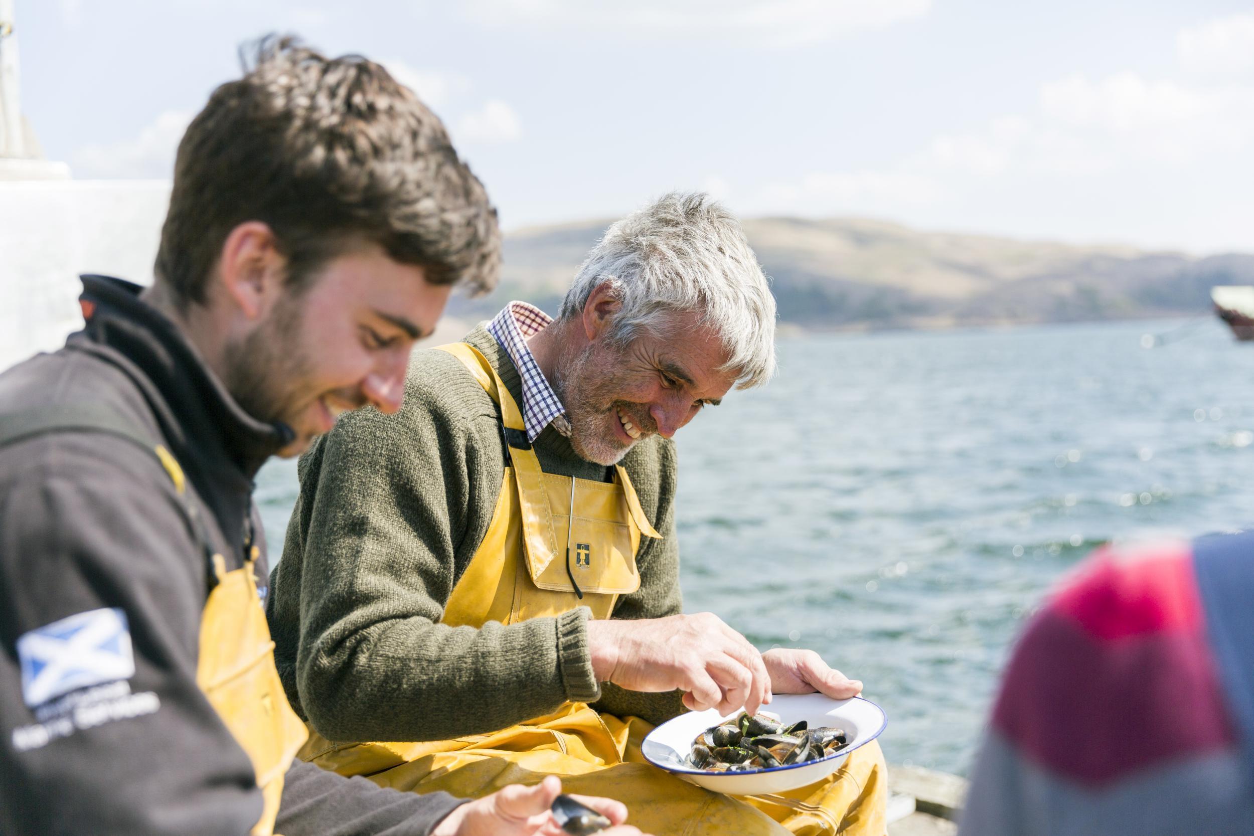
Another example: the image below features in an advert by Lidl commenting on its award as retailer of the year for their sustainably sourced seafood. The image plus the strap line suggest perhaps a fisherman and his son, eating their own catch. Safety, ethics, freshness and smiling faces enjoying the taste of the product are all transmitted quickly engaging the buyers sense of ethics and quality. It feels good to buy this product!  The audience is broad. Perhaps anyone who eats fish and will shop in Lidl. The image is of reasonably well turned out fishermen and so attempting to appeal to a broader range of consumers, and perhaps more middle class, given that Lidl started out appealing to people on lower income. I think it works, the appeal being as much about value for money as well as ethical sourcing, a good solid postmodern principle. 

Image result for lidl fish advert images


Chris Ofili: Artist. Social comment about injustice and racism

Image result for chris ofili

"No Woman No Cry" (1998) was painted as a tribute to Steven Lawrence, killed in a racist attack and dying as a consequence. The image shows a grieving woman, crying tears representing individual murders of black people. The customery plinths of dung represent the shitty side of life, and "deal" that black people often experience in the world. It's his comment on how black people are perceived and as a consequence are treated by individuals and systems.

I think the image is delicately rendered. The contrasting colours are both vibrant and full of life - the yellows and reds, contrasting with the delicate patterning of black pearls creating a mesh to see the image of the woman through. It looks like a container and may be making a comment on the imprisonment of the person for the value she can have to the world. I think its a comment on slavery as well as the individual experience of the murder of a womans son.

http://www.tate.org.uk/art/artworks/ofili-no-woman-no-cry-t07502

Ai Wei Wei: Artist and Film maker

In starting to try and understand the messages and principles of postmodernism, I was introduced to an artist, Ai Wei Wei, in class so looked more closely at his work. I was initially fascinated by an installation called Kippe (2006)


Related image

I was drawn to this piece out of all the images of his work in the reference: "Ai Wei Wei" (2016) pub: Royal Academy of Arts, London. From a visual perspective the wood pieces are pieced together so intricately to form what looks like a perfect dimension cuboid. The contrast of size, wood tone and decorative pieces is enthrawling. It seems like the past being packed away, forming its own transportable packing box.  The pieces are framents from dismantled temples of previous chinese dynasies. Its recycling but its also a comment on the current era and what these elements meant. I wanted to know what A Wei Wei was trying to say:

Ai's Kippe, too, was another work that stands out for its warmth, beauty, and personal qualities. Appearing to be an enormous pile of wood stacked for the fireplace or oven, it is packed perfectly tightly to form a flawless block. It incorporates architectural ornaments, mere splinters, and slices from cross-cuts of the beautiful ironwood trees. It forms a wall almost like  an oven glowing a steady heat. Who would need anything the woodpile itself does not give?

The notes connect the work to Ai's memories not only of the family's woodpile, but of the village basketball hoop (the uprights) and parallel bars, which are easily read into the structure. Is the success of this piece—its accessibility to the sensoriums and imaginations of others—a result of its genesis in Ai's lived experience? http://starr-review.blogspot.co.uk/2013/05/ai-weiweis-challenges-and-questions.html

 Then there are the installations from piles of reclaimed wood, like “Kippe,” that get their strength from knowing that each piece of the sculptures was once part of a Qing Dynasty temple that was dismantled to make way for the new buildings of China. The most interesting of these temple pieces in DC was actually not in the Hirshhorn, but in another Smithsonian institution, the Sackler Gallery, where the wooden pieces were rebuilt into a sort of freeform memory of a temple, a more powerful statement than the clunkier wooden sculptures in According to What? that lost the delicate nature of the temple details in their bulk. https://hyperallergic.com/65829/the-visual-memory-of-ai-weiweis-survey-at-the-hirshhorn-museum/

In looking at his work generally I came across a trailer for a film he has made and is yet to be made available for full viewing. He is a man who is passionate about justice and injustice and uses his art, whether sculpture, installation or film-making to draw attention, bluntly and bravely, about these human injustices.

https://www.theguardian.com/film/2017/aug/31/human-flow-review-ai-weiwei-refugee-crisis

Post Modern Art

Definition:

In art, postmodernism was specifically a reaction against modernism which had dominated art theory and practice since the beginning of the twentieth century. The term postmodernism is also widely used to describe challenges and changes to established structures and belief systems that took place in Western society and culture from the 1960s onwards.

The term was first used around 1970. As an art movement postmodernism to some extent defies definition – as there is no one postmodern style or theory on which it is hinged. It embraces many different approaches to art making, and may be said to begin with pop art in the 1960s and to embrace much of what followed including conceptual artneo-expressionismfeminist art, and the Young British Artists of the 1990s.

(http://www.tate.org.uk/art/art-terms/p/postmodernism)


Transition from Modern Art to Postmodern Art

In searching for a way to understand the difference between modernism and post modernism,  I found this helpful description on the Tate Britain website, as a useful starting point:
Postmodernism was, in some ways, a reaction against modernism. Modernism was generally based on idealism and a utopian vision of human life and society and a belief in progress. It assumed that certain ultimate universal principles or truths such as those formulated by religion or science could be used to understand or explain reality. Modernist artists experimented with form, technique and processes rather than focusing on subjects, believing they could find a way of purely reflecting the modern world.
While modernism was based on idealism and reason, postmodernism was born of scepticism and a suspicion of reason. It challenged the notion that there are universal certainties or truths. Postmodern art drew on philosophy of the mid to late twentieth century, and advocated that individual experience and interpretation of our experience was more concrete than abstract principles. While the modernists championed clarity and simplicity; postmodernism embraced complex and often contradictory layers of meaning.
(http://www.tate.org.uk/art/art-terms/p/postmodernism)
In terms of art styles, it was thought that modernist artists were becoming ever more reductive and abstraction focused. Tim Woods (1999) suggested postmodernism is a reaction to being "bored with the incessant drive for ever increasing minimalism and abstraction, post modernism was part of a re-introduction of ornament, morals, allegories and decoration into art." (Beginning Post-Modernism, pub Glasgow, Bell and Bain Ltd). In reference to "morals",  there is a greater "use" of art as a platform to comment socially and politically about moral issues. I would argue that moral issues were very directly commented on by modernist artists, particularly Dada-ist artists such as Hannah Hock making comment about oppression, fragmentation as a consequence of the political European shifts and relationships with power struggle that individual countries and leaders were having.
I am still in love with the early/mid 20th century art and artists!! On my journey into studying post modernism, I will hang onto the learning and respect I developed for modernism and it's pioneers.

I am also excited to be learning something new and to explore different styles and techniques, finding out what my contempories are saying through their art. I think that is part of my resistance in embracing postmodernism fully. I notice that I'm also suspicious. Established postmodernist artists are of my own generation and there's a sense of therefore being a part of something that I should feel, understand, be implicit with and naturally connect with. Perhaps its a form of sibling rivalry!!!!!!! I say that tongue in cheek but at the same time it is much easier to respect and explore a phase of history that feels ended, complete and distant. Like talking about your grandparents has a different sense than talking about your brother. Their is a current dynamic that is still lively and alive, shifting day to day and not concluded. It's great, but messy.

Friday, 24 February 2017

Paul Klee: Artist

Paul Klee was a Swiss-German artist and one of the founding teachers of the Bauhaus. he had a close friendship with Wassily Kandinsky, who shared not only a love of painting and drawing, but philosophy and music. Each in their own way painted with music as a profound influence. The movements that influenced his art most were Expressionism, Cubism and Surrealism. He is described as a natural draftsman which is evident in many of his geometric work. He also explored colour, this fascination deepening after a trip to Tunisia where the form, light and colour palette marked a change in his work.


He usefully described drawing as taking a line for a walk. Above is the iconic drawing that illustrates this point. This concept was a freeing to draw and mark make in an individual and instinctive way, rather than bound by the "rules" of drawing to create an accurate representation of an object or scene. As drawing underpins most forms of art, this was a huge permission and step change for artists and doodlers.


Klee painted a number of pictures using squares and grids. It is not cubist but more a flat grid style. The colours are what give the images depth. The image above uses more primary colours with tonal shades of the primary colours. The overall palette is rich and bright. The yellow triangles are like central jewels lighting up the frame. The large deep sun or moon also adds the element of a scene that could otherwise be purely abstract as well as adding a curved line in a very angular field. It is a symbol of light which had a weighty level of meaning during the first world war and the early Bauhaus years. 


This second image comprised mostly of colour blocks is much less defined than the picture above but is less abstract. The curved lines suggest domes to buildings, the small black squares, windows. It is a naive and abstracted rendition of a scene that may have painted directly from in Tunisia. The colour palette is earthy, with accents of violet and dark navy. I love it and could stare at it for hours for the colour and my favourite squares!


This image, Fish Magic, feels dark and disjointed in terms of the composition, the elements, fish, flower, circles floating in air or water. The diagonal line coming from the right offers a connection between the objects and offering a shower of water or light. the humour and playfulness of the 2 characters at the bottom of the picture also increase the sense of light. The very dark background allows the flower, fish and planets to shine. Beauty and connection is striven for despite the very dark times when the picture was painted.

Documentary Review: Jackson Pollock

Jackson Pollock Documentary: directed by Kim Evans, narrated by Melvyn Bragg.

This documentary follows the life and work of Jackson Pollock, from the perspective of some fellow artists, family and friends. It offers some fascinating insights into his private life and how his early life and family dynamics in the open planes and expansive skies of Kansas may have influenced his work, style and development as an artist. His work seems clearly influenced by his early life, as suggested by colleagues, in terms of his need to work in big spaces and on large canvas. Family and friends repeatedly described his conflicted and unstable relationship with others and with alcohol. His personality and internal conflict drove his choice of expressionist style and a desire to communicate pure emotion, particularly through his “drip paintings”, as well as figurative work representing primitive images. He was drawn to art and artists that integrated images and motives that linked with his childhood familial and geographic environment.
From my perspective I think these personal reports are vital to understand Pollock’s work, but alone, the outcome is too skewed.  Additional perspectives from others that view his work uninformed of his life could offer different visceral responses purely to his art. Colin Marshall on the Open Culture site says: “Jackson Pollock painted with the kind of visceral immediacy that frees you from having to know much about his ideas, his methods, or his life.” (http://www.openculture.com/2012/12/a_portrait_of_jackson_pollock_presented_by_melvyn_bragg_1987.html )  The judgement about his work purely from people who either loved him or hated aspects of him is polarised as his social circle seemed to be, and Marshall’s comment summarises, for me, what may be lacking in this documentary.   
 His love of nature and the rawness of his experiences is well accounted in this documentary. This is pertinently linked to his completed paintings and the way he painted, the places he painted such as on the floor in the open air. No space was big enough to hold his canvas in the same way that nowhere was big enough to hold him psychologically without him bumping up painfully, against people and things.

The cultural context was also influential in his work and way of life. America was emerging from a depression and changes in people’s priorities and a need to express what was difficult to articulate found its way into many of the contemporary artist’s art, method and perceptions of the world. He had a group of people that he could identify with and “belong” to but which also reinforced his risk taking. Risk taking and volatile outbursts seemed to be endorsed as well as shied away from, perhaps exaggerating the ambivalence and polarity that already seemed to be seated in his personality, which may have added the necessary energy to produce the kind of art that he was capable of. The particular narrative line taken in this documentary, leads me to think that Jackson’s constant internal conflicts both fed the creation of exceptional, ground-breaking work but also left him dissatisfied, self-doubting, then rageful, soothed only by producing  something sufficiently new. An artist’s quest is usually to evolve. He compared himself to Picasso and Matisse but couldn’t manage the internal containment of a big, demanding ego in the same way and seemed to drive himself, literally into a wall. The essence that drove his success also engineered his tragic end.  This documentary depicts this starkly with interviews from his lover and close friends. As a documentary about his life and living, I think this is a brilliant piece of work, but doesn’t necessarily offer the narrative and structure to fully explore pure reactions to his work.   

Natalia Goncharova

Goncharova is a Russian born avant-garde artist, costume and set designer. She was much influenced by the Fauvist and Cubist movement. Her paintings of that period are striking in the form echoing the style of other leading fauvists and cubists with a colour palette that is bright and vibrant.


This image of a machine is lively and full of detail, filling the canvas. The eye is drawn to the plum coloured handles that bisect the image and lead the eye to the magenta cup shapes on left and right of the image. The firey orange components and bolts are brightened further by being surrounded with contrasting rich violet and blues. The image is vibrant with colour and dynamic with a sense of movement.


This abstract painting called Cats (1913) is a potent image. I find the contrast of yellows and ochres with black and greys striking. The word striking is also an element of the form of claws that I see, in combat and striking out at each other. The sharp needle shapes intersecting creating right angles, some shaded gives a very jagged contour to the piece. The elements of magenta perhaps representing the cats mouths, also add more vibrancy and life. I am struck that the position of the magenta elements are similar in position to the magenta cups in the previous image. The choice of subject in politically precarious times, on the brink of world war, is also loaded with meaning. The combat of primal forces, claw to claw and mouth to mouth. 


This image, Gardening (1908) is a much gentler scene and painted in a time that was less torrid despite the tensions building between countries. The subject and depiction is a sharp contrast with Cats. The colour palette is calm in blues, mauves and sandy brown accents. It is a scene of collaboration, industry and tending beautiful things, and yet there is something back breaking in the pose of the woman in the foreground on the right. It has a flavour of Van Goghs paintings of the peasant farmers in the potato fields. The flow of lines, the bold colours and subject.

Cristobal Balenciaga: Fashion Designer

Balenciaga was a very influential designer with a career that exceeded his designs in terms of his influence on other later designers. He was Spanish born and had a reputation for exacting standards. Christian Dior described him as "the master of us all". He was famous for the striking shapes of his garments, particularly for the "puff ball" which featured in many of his designs. Many of his designs were in black or very dark coloured cloth which was effective in showing the line and shape of the garments he designed.


This puff ball skirt is accentuated by the very fitted bodice and long gloves. The hem is asymmetric and cleverly cut to create volume below the hip without creating volume that camouflaged the waist and hip shape of the wearer. The skirt shape is reminiscent of a tulip without being at all "twee". The pose of the model helps illustrate the outfit and the striking linear hat offers a balance to the width of the skirt and an elegant line.


The dress above is another striking example of a fantastical and sculptured shape, almost like a vase. A very feminine shape despite it being so angular and geometric. The "fins" at the shoulders create four distinct corners, and the jewelled embellishment at the front offers a glamorous detailed contrast to the stark shape and colour. Not the most practical dress but stunning to wear and as a piece of sculptured art.


This image shows a 1960's design on the left that is much more wearable.  The skirt and jacket have strong lines and neat collar and pocket finishing. The check fabric is a strong simple line that complements the cut. The image on the right is a more contemporary version demonstrating the longevity of well cut and conceived design. The more modern suit is altered by shortening the skirt and I'm struck how changing the colour of the gloves from white to black transports the outfit from the 1960's to the present day with one small detail.

Alfred Stieglitz: Photographer

Alfred Stieglitz was an american photographer. His photography career spanned over 50 years. Apart from a very skilled and beautiful range of photographic images, a major contribution to the world was his influence in bringing photography into the art world as an accepted form of art.

I have selected a number of images that struck me as images that are telling a story as well as very well balanced compositions. Stieglitz's ability to frame an image from the world around him, seems masterful, particularly the last image where he needs to catch a fleeting moment yet captures so much of a story as well as a well framed composition.


I find the image above beautiful in composition. The balance of the crowd of women on the right looking to the water for... the return of their menfolk? waiting for supplies for their village? It conjours up a story and an anticipation and pulls you into the image with curiosity, wonder and an emotional empathy. The buildings in the background and the contours of the water front add compositional balance. The white structure behind the group of women also weights the picture and feels an essential element in terms of composition, without it the image would feel flatter and less dynamic. The black and white also adds tremendous atmosphere even though the image lacks defined clarity in comparison with the following image of A Venetian Canal.


The original image is much more defined. Again the composition is beautifully balanced. The gondola in the foreground leads your eye to the more distant gondolas and the curve of the boat lines along with the gentle tilt of the boats in the water contrast with the straight lines of the walls and window openings. The upturned u shape of the canal water offers a kind of horizon and with the added reflections from the buildings and boats the image feels full of interest without being busy and confusing. It is restful and harmonious.


Again, the original image of this young boy is crisp. The detail of his clothes, the shiny bumper and fender of the car in the background and the hard pavement offer visually contrasting textures. The striking pose and facial expression of the boy is captured and invites curiosity as to his feelings, his position in life and what he is going to do next. It is an evocative and impactful image.


Thursday, 23 February 2017

Max Ernst: Reflections on Photomontage - Sacred Conversation 1921


Max Ernst was a self taught artist with a deep interest in psychology, philosophy and freudian theory. He also is reported to have suffered trauma during trench warfare during the 1st world war. These experiences seem to strongly influence the subject matter of his art work. This image above is a montage of black and white or sepia photographic elements and drawings superimposed on a background. The floor seems separate from the back drop that looks either curtained or a form including pillars. There is a fragmentation and dreamlike quality to this image. Photomontage is a way of creating this fragmentation and I wonder if that is why it was a choice of artists during such a traumatic time in their own and their communities lives. It facilitates the communication of fracture and a broken world, possibly more than any other art form. 
 The headless and armless body on the right of the picture seems to be floating above the ground with a drawn bird to replace her head. it seems a spirit from of the body still grounded. The body on the left has replacement drawn body parts and a round disc binding the lower legs and so preventing walking. This reminds me of the report of dreams or nightmares when trying to escape from something awful, muscles can't work or something prevents the body moving to escape. The content of the image on looking again and again becomes more disturbing. The exposed body parts and fracture of body and spirit communicate the destruction of beauty, as the elements of the picture are all beautiful but assembled in this way powerfully communicate horror and nightmare.   


A DaDa Chance Poem

Foreign fifth public future to budget,
than been spending to aid for,
directly agencies been Britain billion last,
was spend international set forced ways,
run projects budget annual out year,
has future committed stockpile yet but,
foreign has money nearly and aside,
£12 the for billion of spent,
not of more of money aid,
of to the.


This seems to much as make the sense as article original!!!!
   

Museum Architecture, Bauhaus and De Stijl: Group Task


  • The kind of art on display at MoMA (Museum of Modern Art, New York, USA)?

This museum is the largest archive of modern paintings and sculpture from the major modernist artists and movements from the 1890's, such as work by Cezanne, the cubist movement artists, abstract and abstract expressionist movements to art from current major artists. It currently comprises over 3,600 works.

It has 6 other curatorial departments, including drawing, photography and architecture, film, prints and illustrated books. It is a base of conservation and research and represents the most important collection for art and design in the world.


  • What kind of paintings are on display at the Muse D'Orsay, Paris?
Originally the paintings exhibited at D'Orsay were previously shown in the Musee de Luxembourg and reflected the the official "taste of the day" focusing on history painting, portraits and classical landscapes. It took pressure by artists, collectors and family to include contemporary art.  The Orsay now houses paintings from the mid 19th Century and early 20th century as they fall outside the focus of other museums such as the Musee D'art Moderne. . 

  • What was the Louvre originally used for?
The Louvre was originally built as a fortress in 1190 but was repurposed as a royal palace in the 16th Century. It was expanded many times and the museum is housed in a part of the palace. In 1699 the first series of salons were held. During the French revolution it was agreed that the Louvre should house the nations greatest art treasures and the museum was opened in 1793 with an exhibition of over 500 paintings.

  • What building was the British Museum modelled on?
The British museum is dedicated to human history, art and culture. the museum was established in 1753 and opened in 1759. The main part of the building is designed by Sir Robert Smirke and the facade closely resembles the Temple of Athena Polias at Priene in Asia Minor. It has 44 greek revivial style columns and the pediment over the main entrance is decorated with sculptures by Sir Richard Westmacott. The museum has been built on and remodelled a number of times, including the latest development, creating a reading room with a domed glass roof.

  • What does Zeitgeist mean?
The defining spirit or mood of a particular period of history as shown by the ideas and beliefs of the time.

  • What .... follows function?
Architect Louis Sullivan coined the phrase form follows function. This became a central principle of the modernist designer.

  • What did Le Corbusier think of the "decorative"?
A modernist approach to design, where form follows function, means that decoration has to serve a purpose and is integrated as part of the form as opposed to prettying up a functional object that interferes with it's function. The function leading the design process where decoration is either secondary or irrelevant means that objects can be mass produced with more functional materials and so available to a mass of population rather than a few that can afford. The leveling of society can start with a products being available to everyone and a modern society with less hierarchy and so reflecting the philosophy of equality is able to be achieved.

  • What were the main building materials of modernist architects like Mies Van Der Rohe?
Steel and plate glass defined the form and style of modernist architecture. Concrete also. The created clean, planes, space. Colour was also introduced. These materials required different design solutions and building methods and was a stark turn away from classical design and more expensive materials and building methods.


Paul Rand: Graphic Designer

Paul Rand was a largely a self taught designer, coming from very humble beginnings in New York. He was best known for his corporate logos for IBM, ABC, Enron and many other large corporations.


I particularly like this logo. It is not directly communicative but is playful, colourful and almost minimalist despite the amount of colour. The choice of motives communicate busy liveliness, a positive image for a big creative company. It also maintains the M from a previous more sedate but recognisable logo where the capital I and B matched the blue hatched M in this logo. It suggests a holding onto the good things of the past but is "busy" (bee), looking (eye) for new things. It communicates much in its simplicity. An important part of the success of his work was his ability to convince company's that good commercial design was important to sell good products. It is summarised in a poster that has a style he repeated for film advertisements.


The modernist philosophy was a core influence in his work and he was equally revered by others such as Moholy Nagy.

His playfulness was ideal for illustrating the children's books his wife wrote:

A little dated now, this book however has a simple cover with attractive colours and an engaging simplified numerical character with a red bow tie and contrasting green stripey jumper. Fun! If something makes you smile in the way that his work makes you smile, it connects the product in a positive and warm way. It welcomes you to the product without you feeling seduced in a negative way. I think his work, just for this, is genius.

William Addison Dwiggins: Graphic Design


William Addison Dwiggins was a type designer, calligrapher and book designer. He was a thoughtful, witty man and was the first to coin the phrase graphic designer. He wanted to raise the standard of book design and advertisement design, designing type faces that were representative of the emerging modern way of life. His Metro series was clear and bold and still looks contemporary, although reminiscent of the 1920's. I think it has a timeless style because the shapes of the letters are balanced and clear.


An example of the Metro font as it could look in an advertising poster:


I feel the type face and the way the poster is designed reflects the emergence of the modernist style. It's forceful, with clean lines with any curve or embellishment where a straight line can communicate the letter. 

Dwiggins also designed books, book decoration and marionettes!


This is an earlier piece of work but I love the simplicity. The "action" part of the text is highlighted by reversing the colour of the font and the background along the top dominant edge. The image and pose of the marionette is beautiful, elegant and the delicate strings create contrast to the strong angular lines of the limbs. Just as an image I think it has tremendous balance and beauty. The type face is "fancier" and of the time. There is still a move to the modern way of design compared to his earlier illustrative work.