Thursday, 12 April 2018

Judy Chicago: Painter, Sculptor and Installation Artist

This article summarises some of the principles that guide Chicago's work:

http://www.theartstory.org/artist-chicago-judy.htm

"I believe in art that is connected to real human feeling, that extends itself beyond the limits of the art world to embrace all people who are striving for alternatives in an increasingly dehumanized world. I am trying to make art that relates to the deepest and most mythic concerns of human kind and I believe that, at this moment of history, feminism is humanism."

Judy Chicago would call herself a feminist artist. She sought to challenge the male dominated art world and produced images, sculptures and installations that were very personally female. Some of her work was seen as shocking with her plain use of vaginal imagery.

"Just as she elevated explicitly female subject matter, Chicago embraced artistic media whose creators were exclusively or mainly women and (perhaps not coincidentally) dismissed by the high art world as merely "craft." Art forms such as needlework, ceramic decoration, and glass art are central to Chicago's work, often included alongside traditional high art media, such as painting. Works such as The Dinner Party helped validate the importance of crafts-based art forms and break down the boundaries separating them from their "high" art counterparts."

Image result for Judy Chicago art images
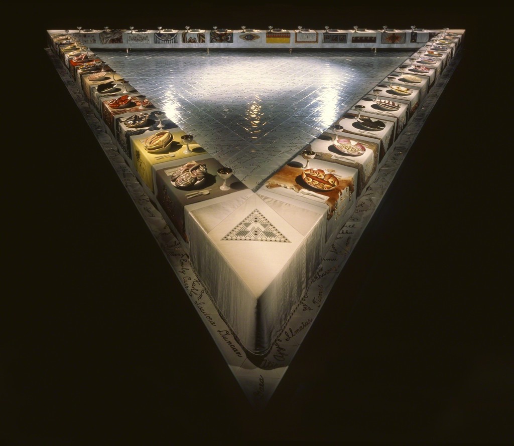
The Dinner Party (1979)

“Thirty-nine place settings, each commemorating a female historical or mythological figure, are placed around an equatorial triangle, formed from three tables. Each of the thirty-nine women is represented on a hand-painted plate by an abstract form based on ‘central core’ vulvic imagery: an embroidery and a chalice. On the base tiles are inscribed a further 999 names. The work’s chronological sequence traces the social origins and decline of matriarchy, its replacement by patriarchy, the institutionalization of male oppression and women’s response to it. The work toured internationally and attracted among the largest crowds ever to view a museum exhibit.”
http://uk.phaidon.com/agenda/art/articles/2016/july/20/how-judy-chicago-made-a-feminist-masterpiece/

Image result for Judy Chicago art images
Earth Birth (1983)

"During the early 1980s, Judy Chicago worked on the "Birth Project," a series of images she designed for execution by a network of skilled needleworkers spread across the U.S. These needleworkers were volunteers who had either stayed in contact with Judy Chicago following their work on images to give expression to an important aspect of female experience too rarely depicted in fine art while linking these individual birth experiences to ancient, archetypal, female-centered myths of creation. The designs for several images in the series, most notably executed in a variety of needlework mediums over a several year period. The work depicted here is "Earth Birth "(1983), a sprayed acrylic on fabric painting by Judy Chicago with quilting by Jacquelyn Moore. "Earth Birth" is also available as a 1985 serigraph by the artist and as one of five serigraphs in a suite called Eve Images from the "Birth Project.""
https://www.wikiart.org/en/judy-chicago/earth-birth-1983


Wednesday, 11 April 2018

Frida Kahlo: Female Artist

It seems necessary in my own mind to say "oh, the artist is a woman!" The more I study art, the more I am impacted in the still massive imbalance of male to female artists, despite during my education, the massive imbalance of girls studying the arts compared to boys. There are more women recognised for their art now and I can't help but have more and more respect for those women in the early part of last century, wading against the huge power of numbers and critique. She had an unusually powerful sense of self and entitlement which must have been her defense against a world that would regularly say no, and certainly wouldn't pay the same for the same thing: good art.

https://en.wikipedia.org/wiki/Frida_Kahlo

"Frida Kahlo de Rivera (Spanish pronunciation: [ˈfɾiða ˈkalo]; born Magdalena Carmen Frida Kahlo y Calderón; July 6, 1907 – July 13, 1954) was a Mexican artist who painted many portraits, self-portraits, and works inspired by the nature and artifacts of Mexico. Inspired by the country's popular culture, she employed a naïve folk art style to explore questions of identity, postcolonialism, gender, class, and race in Mexican society.[1] Her paintings often had strong autobiographical elements and mixed realism with fantasy. In addition to belonging to the post-revolutionary Mexicayotl movement, which sought to define a Mexican identity, Kahlo has been described as a surrealist or magical realist.

Kahlo's work has been celebrated internationally as emblematic of Mexican national and Indigenous traditions, and by feminists for what is seen as its uncompromising depiction of the female experience and form.[2]"

Frida Kahlo - Self Portrait With Necklace

Kahlo painted many self portraits or pictures with herself depicted. The portrait is not directly face on but she is looking at the viewer. Her hair is tied back and so her face is very prominant. Her strong eyebrows, which she always included to identify herself, however naive the painting, almost feel like she is saying something about her self aware strength and identity. In the same way she rarely neglects the shadow of upper lip hair. A statement about her masculine self perhaps..The delicate lace of her dress is in stark contrast with her strong and dark features, and a necklace talks of her self respect and dignity somehow.

Related image

I love this painting and to see Kahlo with the painting. The lush, exotic greenery in the background is a brilliantly balanced colour palette to illuminate her face. The necklace, organic and still growing around her neck, butterflies as hair adornments connect her profoundly to these natural elements. The two creatures, a cat and a monkey on her left and right shoulder respectively, may be suggesting something about aspects of her self. A curious and intelligent creature, and an independent, mystical creature. The cat may be aware of the dead bird around her neck and she seems to be wearing the dynamic and drama of hunting as an integral part of her own life's drama. This image is loaded with symbolism. Kahlo makes beautiful art with strong images anmd a potent message of personal and cultural identity.

Anish Kapoor


I find the work of Anish Kapoor stunning in its simplicity of line and limited but strong or no colour palette. My favourite piece is a sculpture made from alabaster and cut into, creating ever reducing windows. The outer part of the sculpture has the raw surface of the untreated rock whilst the polished and cut forms are perfectly engineered, with straight, unatural lines making the manmade and the natural form a thing of intriguing beauty.


Related image

Blind 2013 (Alabaster)

Related image

This impossible looking sculpture looks like it is made purely from pigment, with the remaining red dust on the floor suggesting its material. The simple but beautifully curving lines that come to a point suggest an unfurling leaf, a sharks fin under immense pressure! or an exposed hook. The colour is the reddest red and curated in a blank space where it seems to burst through the floor is impactful and alluring.

https://www.lissongallery.com/artists/anish-kapoor

"Anish Kapoor is one of the most influential sculptors of his generation. Perhaps most famous for public sculptures that are both adventures in form and feats of engineering, he manoeuvres between vastly different scales, across numerous series of work. Immense PVC skins, stretched or deflated; concave or convex mirrors whose reflections attract and swallow the viewer; recesses carved in stone and pigmented so as to disappear: these voids and protrusions summon up deep-felt metaphysical polarities of presence and absence, concealment and revelation. Forms turn themselves inside out, womb-like, and materials are not painted but impregnated with colour, as if to negate the idea of an outer surface, inviting the viewer to the inner reaches of the imagination. Kapoor’s geometric forms from the early 1980s, for example, rise up from the floor and appear to be made of pure pigment, while the viscous, blood-red wax sculptures from the last ten years – kinetic and self-generating – ravage their own surfaces and explode the quiet of the gallery environment. There are resonances with mythologies of the ancient world – Indian, Egyptian, Greek and Roman – and with modern times, where 20th century events loom large."

Ai Wei Wei: Human Flow

Further to the posting for the trailer for Ai Wei Wei's film, or cine-essay: Human Flow, the film was released in December 2017 and The Guardian reviewed the film, post release:

https://www.theguardian.com/film/2017/dec/07/human-flow-review-ai-weiwei-migration-documentary

I watched the film. It was one of the most impactful, moving and emotionally demanding pieces of cinema I have ever watched, in as much as it raises awareness of the magnitude of the issue.

As the reporter from the Guardian comments, it is beautifully shot. The camera shots are often from above and so help give a perspective to the scale of the number of people that may be on the move at any one time, and the distance from them also speaks of their alienation. There is a reduction in dialogue and the images speak profoundly of the plight and difficulties. The film, in taking account of the huge number of people across the world attempts to describe the magnitude of people being constantly affected by the many complications and consequences of being made a migrant. It also focuses on the individual stories which takes away from numbers and turns people into individuals, and so empathy and impact become immediate.

Charles Jencks: "The Architecture of the Multiverse" Lecture at Harvard GSD


https://www.youtube.com/watch?v=_LoaQAbK-mk

Charles Jencks AB ’61 BArch ’65 is a cultural theorist, landscape designer, and architecture historian. Among his many influential books are Meaning in Architecture (1969), The Language of Post-Modern Architecture (1977), Adhocism: The Case for Improvisation (with Nathan Silver, 1972), The Daydream Houses of Los Angeles (1978), Bizarre Architecture (1979), and The Architecture of the Jumping Universe (1997). He is also co-founder of the Maggie’s Cancer Care Centres, named for his late wife Maggie Keswick, and has written about this project in The Architecture of Hope (2015). Jencks has taught and lectured widely and served on numerous juries and selection committees; his work has been recognized with numerous awards and honorary degrees. As a landscape designer, Jencks has completed several projects in Scotland, including the Garden of Cosmic Speculation (2007) and Jupiter Artland (2010). In his lecture, he will speak about his ongoing project the Crawick Multiverse, about which he writes:

The cosmos is almost the measure of all things and provides a referent and subject, a focus otherwise hard to find in present day society. With a few architects the patterns of nature and the architecture of the universe have partly reemerged as a shared meaning and iconography. At the same time the Multiverse has emerged on the agenda among scientists. Is this now a subject of thought and ultimate meaning? I have explored it in the architecture of the multiverse, an unfinished project. Where it leads, the imagination follows.


Paolo Portoghesi: Post Modern Architect (with a nod to Hundertwasser)

In looking at post modern architecture I am drawn to the work of Paolo Portoghesi and struck by "Italian" his work looks despite working and living in an increasingly homogenised style.

Image result for Paolo Portoghesi

Casa Baldi (1959 - 61) This is a querky and beautiful building with roof balconys and an interesting patterning to the brick work. It's most striking feature is the curved lines and curved walls which must be a builders challenge.

It has a striking resemblance in terms of its lines to a later work in 2002, designing "Il Teatro Politeama a Catanzaro

Image result for Paolo Portoghesi

Portaghesi has specialized in teaching and researching Classical architecture, especially Baroque architecture, and in particular Borromini, but also Michelangelo. His interest in more contemporary architecture coincided largely with that of his colleague in Rome, Bruno Zevi, in championing a more organic form of modernism, evident in, for instance, the work of Victor Horta and Frank Lloyd Wright, and in Italy with neorealism and the Neo-Liberty style. This attitude has continued throughout Portoghesi's career, and is clearly visible in his own architecture. It is also evident in his concern for the studies of nature, brought to the fore in his more recent book Nature and Architecture (2000).

In terms of studying nature, I am also struck by some similarity in the work of Hundertwasser, also adherring to a tennet of creating architecture that has direct connection with the flow of lines found in nature. Hundertwasser's work is much more fantastical in form and colour, more eccentric perhaps but the relationship in the lines seems to return both artists to nature for their inspiration, blending the necessary linear structural lines for the possibility of building but haling nature where it is possible.

Hundertwasser’s Inspiring Architecture

Blood Diamonds

The following article offers a perspective or an account of the dynamics of the diamond trade. It is now over 10 years old but it seems many of the arguments apply.

https://www.counterpunch.org/2007/03/16/the-political-economy-of-diamonds/


--------------------------------------------------------------------------------------------------------------------------
I found this article interesting. It is the consequence of market research and not addressing the broader political meaning and use of diamonds and the politics related to it, but it does indicate there is a shift in women's increasing independence and selecting diamonds to purchase for themselves and their own reasons: "I love myself, rather than a man loves me." Much of the research was based on the purchasing habits of chinese and japanese women. China is very involved in the receipt of the diamond trade so the DeBeers marketting strategy is heavily underpinned by the immoral transit of diamonds.

http://www.rough-polished.com/en/analytics/108261.html

DeBeers still own the monopoly of the diamond trade and still their role is to maintain an unfair possession of a resource that does not belong to them. I do not beleive that if diamonds were a british resource being mined and processed on british soil, that it would allow their processing and profits to be appropriated by another country. Its just "plain wrong".

A way to have a fair future for diamonds is either to reduce their monetary value or to establish a fair trade program where the mining/gathering, processing and profits from diamonds stays with the people who live in the areas where they are found. If it were possible to depoliticize the diamond trade (??!!) then the economy of these brutalised countries may increase for the benefit of those that live there. A bit simplistic but the current situation is outrageously corrupt.

Damia Smith: Artist, Jeweler, Performance Artist

The work of Damia Smith pushes the boundary of jewelery as a purely decorative ornament.

http://www.damiasmith.com/


"The combinations of lacy, organic forms, cursive writing, and tagging on city walls create new hybrid forms. In creating a juxtaposition between urban art forms, provocative words and dainty, feminine lines, I am exploring the expectations and traditional imagery associated with woman in relation to my own surroundings and current events. My newest work explores ornamentation, feminism, gender role expectations, gentrification, and consumerism."

"All of my work involves a relationship between the viewer/wearer/ participant and a specific object or piece of artwork. I am extremely interested in human interactions and their relationships with other humans and objects. Both art and performances can convey ideas and emotions; I want to use these forms of communication to help people become more aware of their own feelings, attitudes and surroundings. This reinforces the importance of art as a social agent, which helps the public to expand its worldview, by allowing the viewers to see themselves inside of the artwork."

Defense Mechanism
This crocheted glove form which ends in spiked cones is wearable but not pleasant to be worn.  It protects and causes pain for the wearer at the same time.

This work draws on very female craft of crochet in a traditional way to make what starts as a conventional and recognisable fingerless glove. The spikey metal extensions as a juxtapose suggest something defensive and attacking both to the wearer and the person observing or receiving contact. This is a powerful feminist statement about the position of some women in certain contexts, and communicates it very directly and effectively. It is very well made and beautiful and delicate to look at, at the same time, engaging uncomfortable feelings. The fact that the pain also applies to the wearer feels like a direct statement about the frustration and retroflection of pain for women in society.


Chain Reaction


Chain Reaction
2016

This enameled copper necklace is an investigation of some of the causes and effects of climate change and shows how this topic relates to individual members of society.  Coal-powered electric plants create some of the largest contributions to the ongoing process of global warming. Air conditioning accounts for the highest average use of electricity in most homes. Though a significant portion of the burning of fossil fuels occurs in the United States, the effects are seen most in North Central Africa with rising temperatures, drought and loss of food sources. This chain creates a direct link from air conditioning, an activity in which many people participate, to malnourishment in Africa.

Land Art: Andy Goldsworthy

Looking at the work of Andy Goldsworthy, I am struck by this image below:

Image result for andy goldsworthy stone in river art images

A large rock in the middle of a river is cleverly coated in autumn leaves and glows like gold in the middle of the river. It is at once natural to the environment and other worldly. The impact of this piece of ephemeral work on the environment is negligible with the ingredients slowly returning to the edges of the river and decaying as they would. This process of the elements reclaiming their leaves would have been fascinating to observe.

I appreciate the skill in creating this. I attempted to coat a small rock with autumn leaves and found it incredibly difficult to get the leaves to hug the rock closely, especially the vertical faces. Perhaps my leaves were too old and had become leathery or beech leaves don't work well. I think maybe Goldsworthy used willow leaves still in a more maleable state!

There are many land artists that use found objects in the environment to manipulate these materials into sympathetic art works that either remain or deterirate, blow away, get moved or consumed by creatures or swallowed up in the earth. This is a fascinating and beautiful recycling and low impact way of playing in nature. It also invites others to move into and travel to the work if its available for common viewing or offers the chance to photograph and retain the art as an image.
 
BBC Documentary about Land Art including the work of Andy Goldsworthy:
https://www.bbc.co.uk/iplayer/episode/b079ckkf/forest-field-sky-art-out-of-nature

This is a beautiful documentary covering various works of five artists including Charles Jencks and Andy Goldsworthy. Goldsworthy was attempting to create some dry stone walling in a vertical piece in countryside, against a dead empty tree trunk and demonstrates the technical difficulties of the work. The collapse of the piece was part of the process as is the frustration of trying to solve this 3D problem and push the materials and physics further than they can go. Capturing the image just before its collapse was an amazing image in my view with stone butting up against wood with the stone re-establishing the original line of the tree.

Counter Culture: Art as a political messenger

There have been artists through all ages that communicate political and moral messages through their art. The post modern era has put this element right in the centre of the movement.


The following link is an interesting selection of pieces of art that carry a predominantly political message.
https://www.widewalls.ch/political-art/


Dmitri Vrubel - The Kiss from 1990
"The world famous graffiti at the Berlin wall, originally named My God, Help Me to Survive This Deadly Love, but also known as The Kiss, The Kiss of Death or the Fraternal Kiss is depiction of a historical kiss between Leonid Brezhnev and Erich Honecker at the ceremony of the foundation of the German Democratic Republic. It is interesting that the graffiti was created by Dmitri Vrubel in 1990s after the Berlin wall was down and it reflecting the continuation of the politics from the cold war era in the time of changes."


The writer uses a term called socially and politically engaged art as a separate motivation to propaganda. When considering the place and role of art in a political world, the writer also says: "But when disputing politically engaged art we must not forget that art is not and could not be the mere means of political action nor reduced to this specific function; although it could be an active part of activist practice."

"The role of political art has always been crucial since it is one of rare uncorrupted forces of emancipatory actionand battlefield of the crucial dispute what is and what could be beauty, truth, and the good."

Political art can provoke conversation and debate, drawing attention to an issue. It can be a fascilitator, a catalyst. 

Peter Mitchell: Photographer

Peter Mitchell is a Leeds based photographer. He was a lorry driver in Leeds and stated he was fascinated by the buildings he found in back strrets of leeds whilst he was a lorry driver and carried a camera to capture images of these buildings. He developed a book called "Strangely Familiar" comprisng these images.

http://strangelyfamiliar.co.uk/leeds-back-streets-in-1970s-caught-on-camera-bbc-feature/


Image result for pete mitchell photographer images

I like the composition of this image. The space between the phone box and the derelict maisonettes at the back of the image communicate abandonment and desolation, but the colours and the structure have their own beauty.

Image result for pete mitchell photographer images

This image of an old cinema including two figures standing by, posing for their own photograph is a fascinating parallel to staring in a photographic image. The lines on the brick work left by weathering and removal of parts of the building, and grafitti again suggest abandonment and something of a faded glory and time moving on. The cinema being the ghost of a time when the cinema would have been an exciting and slightly glamourous focal point in the community.

Image result for pete mitchell photographer images

This composition isn't immediately recognisable as a building. The cells of rooms with the broken debris look like faethery, delicate decoration amongst the rigid geometric structure. The position the photo was taken from shows the perspective of the building, the walls and lines create an intricate abstracted geometric image. Remnants of colour on the back walls indicating the fashion of the day and some individualisation in a very homogenous living space.

I love the work of Peter Mitchell because of the intimate links of places very well known to him. 

Tuesday, 10 April 2018

Is Richard Prinz an Artist?

The following article from the national newspaper: "The Guardian", explores some of the controversy around the work of Richard Prinz. He uses many pieces of photographic work from other photographic artists and adjusts/modulates them, sometimes very minimally. Many of his pieces, at least at a superficial visual scan look very much like the original pieces of work and this invites criticism regarding copyright, appropriation, fraud and whether his work is really his work.
For example, this exhibition below is by Prinz, comprising of images taken from instagram shots with no permission for their use. It created a typical controversy about whether it was his work, and money he was making from these images wasn't reasonable or legitimate. The images were marginally modified by increasing their size and applying them to canvas and adding some script or imojis at the bottom of them.
Richard Prince’s New Portraits exhibition, which used photographs taken from Instagram.
https://www.theguardian.com/artanddesign/2016/jan/04/richard-prince-sued-copyright-infringement-rastafarian-instagram

The following article summarizes some of the debate about the work, or appropriated work of Richard Prinz. He appears to be a notorious and disliked person in the photography world. The article articulates the difficulty most struggling photographers have in pursuing a case in court, because of cost and the fact that a tried case was won by Prinz on the grounds that he had sufficiently modified to make it a "different" image. If the case against Prinz is not legally upheld it does appear that there may be a moral case. He does not pay for any copyright to those that have profoundly contributed to his work. This seems a large part of the resentment toward Prinz that is building up in the industry.

https://www.plagiarismtoday.com/2015/05/21/why-so-many-photographers-hate-richard-prince/


Class discussion concluded mostly that Prinz was not a true artist because of the amount of used imagery and wasn't even an attempted copy by using the same content and composition, a style that many artists use. His attitude of not being interested to consult the original artists and not caring what the original artists think, feel or say adds fuel to the growing dislike of him as an artist. My personal view is that he is not an artist but a clever business man who collects or replicates others work and sells it on.

Monday, 9 April 2018

Dan Mountford: Graphic Artist

Dan Mountford uses double exposure to create multi textural images, mainly figurative. Portraits created using facial images, landscape and related images.

https://kirabuttersphotography.weebly.com/dan-mountford.html

The images below are carefully crafted. The first image has a face profile, outlined using a geometric mesh, with an ornate architectural image cloaked in trees forming the rest of the image. The second image using the London Eye as the central image, has a similar format with tree and foliage creating the texture and outline for the upper body. These images communicate to me, the juxtaposition of internal and external worlds and a suggestion of an internal landscape.

Image result for Dan Mountford images

Image result for Dan Mountford images


Neville Brody: Graphic Artist and Typographer

Neville Brody is probably one of the most well known graphic artists of his generation. He studied graphic design at the London College of Printing where he was successful but a challenging student, in his experimental and ground breaking designs. His first commercial successes were poster, record and music magazine images.

A bigraphy and summary of his career is descibed in the article below:
https://davidcarson1996.wordpress.com/neville-brody/


These images combine typography to create pattern and figurative images as the one on the right. The graded colours add depth to the images as do the various styles and sizes of typography.
Image result for Neville Brody graphic most notable art images


https://berkedoganogluva312.wordpress.com/2011/12/27/neville-brody/

"Neville Brody is a typographer and after Macintosh computers emerged and is famous for being cutting edge and pushing boundaries. He is probably the most famous graphic artist of his generation. He worked for the Face magazine, and with his contribution the magazine was very influential and it was even called ‘Style Bible’ because most of the magazines worldwide was influenced by Neville Brody’s typographical approach which was very fluid and expressive. Around these times Neville Brody didn’t use any computer. First it was very difficult learning for him to play around with a Macintosh but then he was very inspired because he felt that he could delve into typography more since manipulating typography was very good for him. Traditional methods had outcomes that weren’t so much advanced as the computers’ results. Neville Brody was inspired by mainly punk style. Also he was very much inspired by Dadaism and Pop Art."

Related image


Sunday, 8 April 2018

Globalisation and Multiculturalism within Post Modern Society - Yinka Shinobare

The work of artist, Yinka Shinobare is characterised by the concepts of cultural identity, race, class, globalisation and questions the meaning of cultural and national definitions, through sculpture, painting, photography and film.

 He was born in Britain but grew up in Lagos, Nigeria. His father was a lawyer so would have been considered coming from a rich family in this culture. He returned to Britain to study A levels and then art. The cultural influences in his early life can be seen in the art he designs, and I'm guessing deeply informs his beliefs about race, culture and class. 

Biography:   http://www.yinkashonibarembe.com/biography/

He uses many hard and soft materials in his artwork and is particularly famous for using african batik cloth, mass produced in Holland.

Image result for yinka shonibare art images

Nelson's Ship in a Bottle, during its occupancy on the forth plinth in Trafalgar Square.

https://www.artfund.org/supporting-museums/art-weve-helped-buy/artwork/11795/nelsons-ship-in-a-bottle

"The work is a scaled-down replica of HMS Victory, the ship captained by Nelson. It was commissioned by the Greater London Authority in 2009 for the fourth plinth in Trafalgar Square, where it was displayed from May 2010 to January 2012. The only significant departure from the historical Victory is the use of richly patterned ‘Dutch Wax’ fabric (a trademark of the artist’s work) for the 37 sails. The fabric is commonly associated with African dress and symbolic of African identity and independence. Tying together historical and global threads, the work considers the legacy of British colonialism and its expansion in trade and Empire, made possible through the freedom of the seas and new trade routes that Nelson’s victory provided. "

One of Shinobares most notable works is an installation : "Gallantry and Criminal Conversation (Parassol)" (2002). It represents the experience of 'The Grand Tour', from a 21st Century perspective, the Grand Tour being a fashion for young socialites to tour europe and come of age. It seems that exploring sexuality and sexual experience was a profound element in the experience. The installation draws attention to the public and private face of this grand tour experience.


https://africa.si.edu/exhibits/shonibare/gallantry.html

Image result for gallantry and criminal conversation